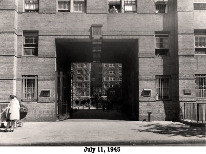

KV has lost it. If you didn’t live there prior to the early 1950s, you don’t know what you’re missing. KV was built not as a sterile “housing project,” but with style, art deco touches, and wonderful details—from the small black buttons on the lobby intercom to the mailboxes with the horizontal slit near the top so you could drop in a note, to the vertical slits in the middle so you could see if you had mail. Sure you could pop open the door with a screwdriver, but non one did that. It all gave KV a distinctive personality. Kids have an appreciation for details that are often overlooked by adults.
When I lived in KV, the gates were never closed. The doors in the basement didn’t have supplemental chains and padlocks. There was an overall feeling of warmth, safety and security. That started to change in the early ‘50s when tenants first began to install additional locks on their apartment doors. In AH8, we even got one of those security devices that used a bar that braced against the door.
Looking at some of the reunion photos that Dave has posted, and from my own visits back to KV in later years, the atmosphere has changed radically. KV has gone from being a mellow, laid back, beautiful creation (from my childhood perspective) to something like a fortified “Green Zone.” There were gates everywhere. The only thing missing were armed checkpoints (VARE ARE YOUR PAPERS?!!)
Elevator door windows, once clear glass now bear a steel web—one of a multitude of changes. Much, if not all of the original beauty envisioned by the designers has been sacrificed on the alter of safety and security. The warmth has long vanished.
Maybe the folks growing up in KV today will form their own attachment to the present day village. Yeah, I know the world changes, and there were the folks who thought the world was going to hell when the automobile started replacing the horse (maybe the thought was that cars were cold and sterile while horses were warm and friendly).
All I know is, that if I was growing up in KV today, 55 years from now I don’t think I’d have anything to say about it.
Dave's editorial reply
Having revisited there a lot I agree it's not as beautiful as it was, but it still has its charm and attractiveness. It's also the worse for wear and tear. The courtyard is very well kept with tasteful plantings and the hallways are very clean. It's one of the few places left in Manhattan with affordable rents. Security? That unfortunately is a 21st century fact of life. Lack of warmth perhaps is a modern day deficiency everywhere. I didn't live there in those glory years of the 30's and 40's and I must have missed out on that attention to detail "gene" (I'm certainly thankful that Cliff has his) but I think it's a universal phenomenon that people look back on the past and imbue it with wonderful qualities that it may not have always had.
Cliff's editorial reply, reply
Dave-
I can't agree with your reply. When KV was built, all the details were designed as a blend of form and function. The aesthetic elements were an intentional part of the plan. All the changes and modifications after the fact to the original design were for function (safety, security etc) and were done so at the expense of the original aesthetic elements. If you were to take, let's say, the outside elevator (both the inside and the outside of the door) and also an apartment door, and compare the original with the present, I believe that an objective evaluation of the "pleasingness of design" would prove my point. The size and fonts of the letters and numbers marking the floors and the apartments had style back then. They are bigger, blockier, and OK, more easy to read now. But they lack style. Too bad you can't compare the original door knocker with the one you show with the "Guns & Roses" installlment. The original had simple elegance compared to the gaudy, horsey present one.
I could go on and on.
Of course KV is not the exception. If you look at the original pre-war Bronx apartments on the Grand Concourse and compare them to the present day, the differences would be just as evident.
Take cars as another example. A '30s Duesenberg compared to a modern Ford Taurus. The Ford is more practical and functional. But which is more beautiful?
Sure, beauty is in the eye of the beholder, and we tend to glorify the past. But design and style still can be judged in their own right.
The previous chapter of Cliff's KV notes


No comments:
Post a Comment